Visualizing training performance with TensorFlow 2 and Keras
October 8, 2019 by Chris
Sometimes, you don't want to visualize the architecture of your Keras model, but rather you wish to show the training process.
One way of achieving that is by exporting all the loss values and accuracies manually, adding them to an Excel sheet - before generating a chart.
Like I did a while ago 🙈
It goes without saying that there are smarter ways for doing that. In today's blog, we'll cover how to visualize the training process in Keras - just like above, but then with a little piece of extra code. This blog covers precisely what you need in order to generate such plots, it discusses the Keras History object which contains the data you'll need and presents the visualization code.
In this tutorial, you will learn...
- That a History object is attached to
model.fitin TensorFlow/Keras and that it provides useful information. - What the structure of this History object is.
- How to visualize the contents of the History object to see model performance across epochs.
Let's go!
Note that model code is also available on GitHub.
Update 26/Jan/2021: updated the article. It now uses TensorFlow 2 meaning that it works with recent versions of the library. Additionally, the headers were changed, and a few textual corrections were made.
Code example: visualizing the History object of your TensorFlow model
Here is a simple but complete example that can be used for visualizing the performance of your TensorFlow model during training. It utilizes the history object, which is returned by calling model.fit() on your Keras model. This example visualizes the training loss and validation loss, which can e.g. be MAE.
If you want to understand everything in more detail - such as how this History object works - then make sure to read the rest of this tutorial as well! :)
from tensorflow.keras.models import Sequential
import matplotlib.pyplot as plt

# Some TensorFlow/Keras model
model = Sequential()
model.compile()
history = model.fit()

# Plot history: MAE
plt.plot(history.history['loss'], label='MAE (training data)')
plt.plot(history.history['val_loss'], label='MAE (validation data)')
plt.title('MAE for Chennai Reservoir Levels')
plt.ylabel('MAE value')
plt.xlabel('No. epoch')
plt.legend(loc="upper left")
plt.show()
What you'll need
Since we're creating some actual code, you'll likely wish to run it on your machine. For this to work, you need to install certain software dependencies. Specifically:
- You'll need Python to run Keras, preferably 3.8+
- A recent version of TensorFlow, 2.1.0+ for example.
- What's also necessary is Matplotlib and, by consequence, SciPy.
Preferably, you run these in an Anaconda environment that isolates these packages from your other development environments. It saves you a lot of struggle as packages could otherwise interfere with each other.
The model we'll work with today
In this blog we want to visualize the training process of a Keras model. This requires that we'll work with an actual model. We use this simple one today:
# Load dependencies
from tensorflow.keras.models import Sequential
from tensorflow.keras.layers import Dense
import numpy as np

# Load data
dataset = np.loadtxt('./chennai_reservoir_levels.csv', delimiter='|', skiprows=1, usecols=(1,2,3,4))

# Shuffle dataset
np.random.shuffle(dataset)

# Separate features and targets
X = dataset[:, 0:3]
Y = dataset[:, 3]

# Set the input shape
input_shape = (3,)
print(f'Feature shape: {input_shape}')

# Create the model
model = Sequential()
model.add(Dense(16, input_shape=input_shape, activation='relu'))
model.add(Dense(8, activation='relu'))
model.add(Dense(1, activation='linear'))

# Configure the model and start training
model.compile(loss='mean_absolute_error', optimizer='adam', metrics=['mean_squared_error'])
model.fit(X, Y, epochs=25, batch_size=1, verbose=1, validation_split=0.2)
Why such a simple one? Well - it's not about the model today, so we should keep most complexity out of here. The regular reader recognizes that this is the regression MLP that we created earlier. It loads Chennai, India based water reservoir water levels and attempts to predict the levels at one given the levels in the other 3 reservoirs. It does so by means of the Keras Sequential API and densely-conencted layers and MAE as a regression loss function, with MSE as an additional one. It performs training in 25 epochs.
Let's create a file called history_visualization.py and paste the above code into it.
The History object
When running this model, Keras maintains a so-called History object in the background. This object keeps all loss values and other metric values in memory so that they can be used in e.g. TensorBoard, in Excel reports or indeed for our own custom visualizations.
The history object is the output of the fit operation. Hence, it can be accessed in your Python script by slightly adapting that row in the above code to:
history = model.fit(X, Y, epochs=250, batch_size=1, verbose=1, validation_split=0.2)
In the Keras docs, we find:
The
History.historyattribute is a dictionary recording training loss values and metrics values at successive epochs, as well as validation loss values and validation metrics values (if applicable).
Also add print(history) so that we can inspect the history before we visualize it, to get a feel for its structure.
It indeed outputs the model history (note that for simplicity we trained with only 5 epochs):
{'val_loss': [281.05517045470464, 281.0461930366744, 282.3450624835175, 283.21272195725317, 278.22250578392925], 'val_mean_squared_error': [131946.00690089026, 131610.73269158995, 132186.26299269326, 133621.92045977595, 131213.40662287443], 'loss': [319.1303724563634, 279.54961594772305, 277.2224043372698, 276.19018290098035, 276.37119589065435], 'mean_squared_error': [210561.46019607811, 132310.933269216, 131070.35584168187, 131204.38709398077, 131249.8484192732]}
Or, when nicely formatted:
{
   "val_loss":[
      281.05517045470464,
      281.0461930366744,
      282.3450624835175,
      283.21272195725317,
      278.22250578392925
   ],
   "val_mean_squared_error":[
      131946.00690089026,
      131610.73269158995,
      132186.26299269326,
      133621.92045977595,
      131213.40662287443
   ],
   "loss":[
      319.1303724563634,
      279.54961594772305,
      277.2224043372698,
      276.19018290098035,
      276.37119589065435
   ],
   "mean_squared_error":[
      210561.46019607811,
      132310.933269216,
      131070.35584168187,
      131204.38709398077,
      131249.8484192732
   ]
}
It nicely displays all the metrics that we defined: MAE ("loss" and "val_loss" i.e. for both testing and validation data) and MSE as an additional metric.
Since this is a simple Python dictionary structure, we can easily use it for visualization purposes.
Visualizing the model history
Let's now add an extra import - for Matplotlib, our visualization library:
import matplotlib.pyplot as plt
Next, ensure that the number of epochs is at 25 again.
Visualizing the MAE
Let's now add a piece of code that visualizes the MAE:
# Plot history: MAE
plt.plot(history.history['loss'], label='MAE (training data)')
plt.plot(history.history['val_loss'], label='MAE (validation data)')
plt.title('MAE for Chennai Reservoir Levels')
plt.ylabel('MAE value')
plt.xlabel('No. epoch')
plt.legend(loc="upper left")
plt.show()
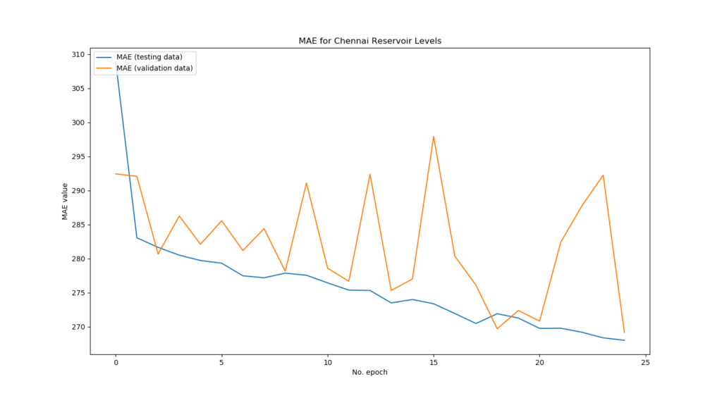
Note that since you defined MAE to be the official loss value (loss='mean_absolute_error'), you'll have to use loss and val_loss in the History object. Above, we additionally add labels, a title and a legend which eventually arrives at this:
Visualizing the MSE
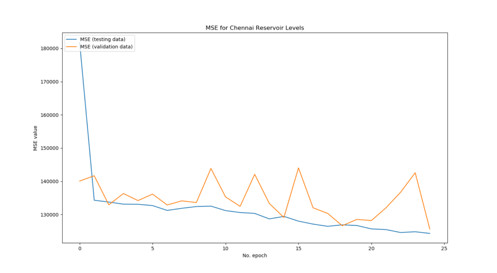
Similarly, we can add a visualization of our MSE value - but here, we'll have to use mean_squared_error and val_mean_squared_error instead, because they are an additional metric (metrics=['mean_squared_error']).
# Plot history: MSE
plt.plot(history.history['mean_squared_error'], label='MSE (training data)')
plt.plot(history.history['val_mean_squared_error'], label='MSE (validation data)')
plt.title('MSE for Chennai Reservoir Levels')
plt.ylabel('MSE value')
plt.xlabel('No. epoch')
plt.legend(loc="upper left")
plt.show()
This is the output for our training process:
Interpreting the training process
What can we observe from the training process?
- Both the validation MAE and MSE are very sensitive to weight swings over the epochs, but the general trend goes downward. This is good.
- Especially testing loss decreases very rapidly in the beginning, to decrease only lightly when the number of epochs increases. This is normal and is a good sign.
- The testing MAE and MSE are less sensitive to weight swings. This might be the case because the model has never seen the data before. This is also good.
- What can be improved is that apparently the model can improve even further: testing loss is still decreasing at the 25th epoch. This means that the model is not yet overfitting to the data and that its predictive power can be increased. The solution: more epochs.
Summary
As you can see, visualizing the training process of your Keras model can help you understand how the model performs. While you can do this manually with e.g. Excel, we've seen in this blog that you can also use built-in Keras utils (namely, the Historyobject) to generate an overview of your training process. With Matplotlib, this history can subsequently be visualized.
I hope you've learnt something today - if so, please let me know in the comments; I'd appreciate your remarks! 😊 Feel free to leave a comment as well if you have any questions or when you think this blog can be improved. I'll happily edit the text. Happy engineering!
Note that model code is also available on GitHub.
Resources
Keras. (n.d.). Visualization. Retrieved from https://keras.io/visualization/#model-visualization
Creating an MLP for regression with Keras – MachineCurve. (2019, July 30). Retrieved from https://www.machinecurve.com/index.php/2019/07/30/creating-an-mlp-for-regression-with-keras/
How to visualize a model with Keras? – MachineCurve. (2019, October 7). Retrieved from https://www.machinecurve.com/index.php/2019/10/07/how-to-visualize-a-model-with-keras/
TensorBoard: Visualizing Learning. (n.d.). Retrieved from https://www.tensorflow.org/tensorboard/r1/summaries

Hi, I'm Chris!
I know a thing or two about AI and machine learning. Welcome to MachineCurve.com, where machine learning is explained in gentle terms.
Getting started
Foundation models
Learn how large language models and other foundation models are working and how you can train open source ones yourself.
Keras
Keras is a high-level API for TensorFlow. It is one of the most popular deep learning frameworks.
Machine learning theory
Read about the fundamentals of machine learning, deep learning and artificial intelligence.
Most recent articles
January 2, 2024
What is Retrieval-Augmented Generation?
December 27, 2023
In-Context Learning: what it is and how it works
December 22, 2023
CLIP: how it works, how it's trained and how to use it
Article tags
Most popular articles
February 18, 2020
How to use K-fold Cross Validation with TensorFlow 2 and Keras?
December 28, 2020
Introduction to Transformers in Machine Learning
December 27, 2021
StyleGAN, a step-by-step introduction
July 17, 2019
This Person Does Not Exist - how does it work?
October 26, 2020
Your First Machine Learning Project with TensorFlow 2.0 and Keras
Connect on social media
Connect with me on LinkedIn
To get in touch with me, please connect with me on LinkedIn. Make sure to write me a message saying hi!
Side info
The content on this website is written for educational purposes. In writing the articles, I have attempted to be as correct and precise as possible. Should you find any errors, please let me know by creating an issue or pull request in this GitHub repository.
All text on this website written by me is copyrighted and may not be used without prior permission. Creating citations using content from this website is allowed if a reference is added, including an URL reference to the referenced article.
If you have any questions or remarks, feel free to get in touch.
TensorFlow, the TensorFlow logo and any related marks are trademarks of Google Inc.
PyTorch, the PyTorch logo and any related marks are trademarks of The Linux Foundation.
Montserrat and Source Sans are fonts licensed under the SIL Open Font License version 1.1.
Mathjax is licensed under the Apache License, Version 2.0.


